Bauducco, the world’s largest panettone producer, revamped its visual identity with Pharus over 30 years, which included refining visual assets, packaging, and product navigation. Transitioning from a Christmas-focused brand to a staple in Brazilian life led to challenges in consistency. As the brand diversified, each product needed a unique visual solution.
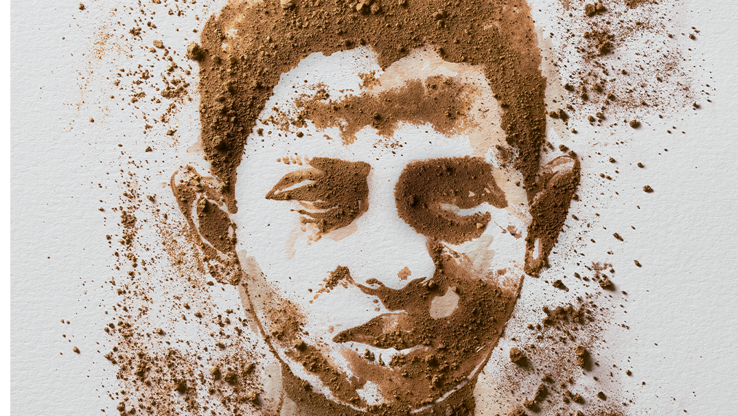
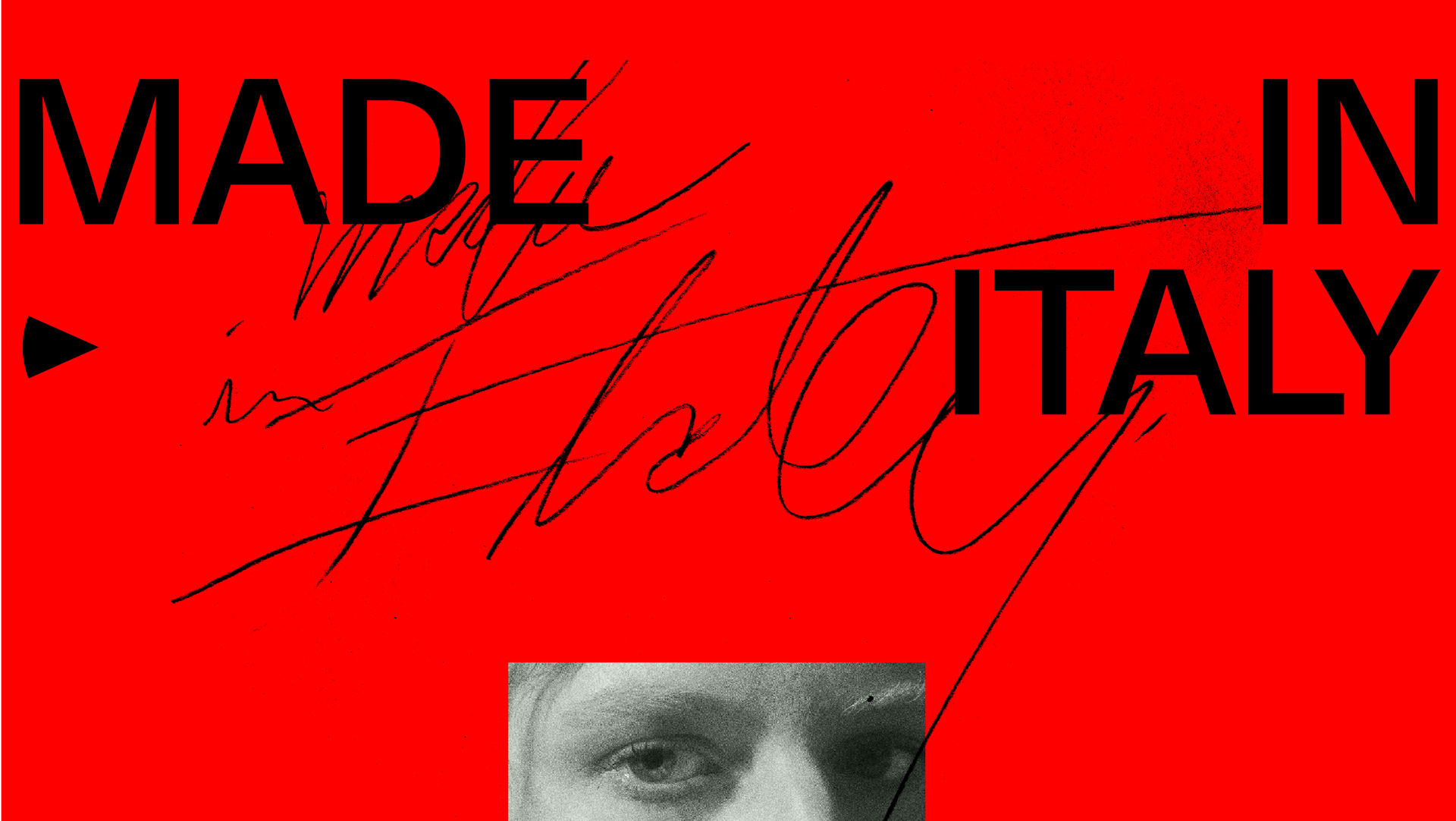
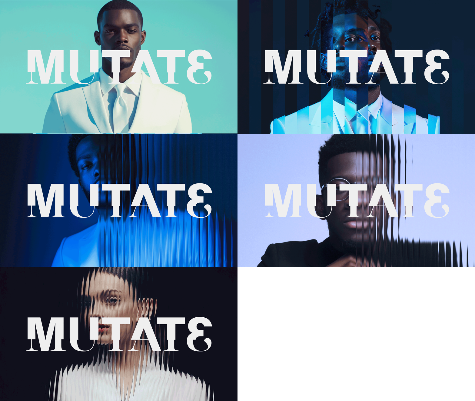
The project embraced Bauducco’s Italian heritage, simplifying the logo, warming the yellow color, and recreating appetite appeals through photography and illustrations. Typography was designed to evoke indulgence, while lifestyle photography adopted a more diverse family perspective.
The new identity simplified a complex brand landscape, integrating design elements from packaging to communication. This included typographic revision, contemporary family concept photography, and a cohesive visual packaging system.
Despite the challenge of Bauducco’s vast product portfolio, the design brought a systemic perspective, improving digital presence and product identification, and appealing to a younger audience. The work blends tradition and innovation, promoting transparency and sustainability, with shipping boxes now used as product displays.
This work was developed by PHARUS BRIGHT DESIGN
Brand Strategy: Solange Ricoy
General Direction: Marcio Mota
Creative Direction: Cris Inoue
Project Coordination: Erick Fugii
Content and Verbal Direction: Vivi Kanô
Designers and Copywriters: Tauana Fernandes, Rodrigo Gondim, Henrique Lucio, Bianca Victorino, Túlio Pinto, Mariana Rena, Luca Bacchiocchi, Gabriela Locateli, Livia Minazzi, Tiê Coelho
Account Manager: Carolina Brandão
Photography: Ricardo De Vicq
Illustrations: We Ilustra and Metaphore GmbH
Typography: PPR Work Studio
Typographic Consultancy: Leopoldo Leal, Fred Dietzsch, Fabio Haag, Ana Laydner
THANKS FOR WATCHING!

